Monday, December 5, 2011

Last Blog


My favorite animation that we watched in class was “The Iron Giant.” This Warner Bros. movie that was made in 1999 was also one of my favorite back when I was 9. Watching it again 12 years later, my opinions of the movie stayed the same. The story is clever, the characters are believable, and the overall message is touching. One thing that I understood more being older was the impact that the Cold War had on the movie. The movie does a great job briefly explaining to children about Sputnik and the fear of robots and foreign invaders. After taking numerous history courses and a course at semester that focused on the Cold War I really can see how much more the movie relates to the fear that Americans had of technological advancements and spies.

Director Brad Bird is a personal favorite of mine and is now a director at Pixar Animation Studios. His most recent film was Ratatouille but my favorite was The Incredibles. Animation has come a long way since the nineties but Bird manages to keep family movie values strong and create excellent pictures.

“The Iron Giant” was based on a 1960’s novel, “The Iron Man.” The movie was nominated for several awards but walked away empty handed. The critques loved he movie and called it “one of the best of its’ time.” Positive reviews such as this is what made the American Film Institute nominate it for one of the “Top 10 Animated Films List.”
Everything in this movie works together perfectly. From the talented cast for voices, to the well developed characters, to the overall theme, music, and storyline. It is a movie that not only shows family values but provides history in a fun way that is easier for kids to understand. The animation is creative as well, the characters and backgrounds look realistic yet have a toy-ish charm to them.

Overall, “The Iron Giant” will remain a classic animated film for children to view throughout history. With almost all animated films now being computer animated it is great to see where it originated, with hand drawn animations, and enjoy true art.

source: wikipedia.com

Monday, November 14, 2011

Nielsen on Usability


Nielsen has many different aspects to which he distinguishes a website as "usable". A website needs to be both design friendly AND easily usable in order to be successful. Unfortunately the balance of both is difficult and there are many websites that contain one or the other and difficult to use.
One website that I find extremely hard to navigate through is my class website for Typography. There is very little telling you where to go, what to click, etc. The design process is there and it is meant to be interesting but for a class site that should really focus on informing the student its confusing. To get into the actual website you have to know where to click in the design without any instruction. It’s accessibility is failed.


Once you find a way into the site it is easier to navigate through with clear headings, titles, labels, etc. Text appearance is good and images are nicely displayed. The main flaw to these pages is the lack of a back button. To get back to the “home page” is a hidden secret that I Just discovered when writing this blog. There is a tiny circle that highlights yellow and if you decide to click that you will be brought back to the mysterious light bulb “home page.”


The website looks creative and appealing but not as a site that I use to get my class assignments. If this were a website that was not as essential to my success in the class then I may not be so concerned. It is also a nuisance that every time you want to open something it opens an individual tab. By the end of finding my assignment I have 3 to 4 pages open, it is annoying and not useful. Overall, its intent to being a modern class website is there, but it is not as useful as intended.

Monday, November 7, 2011

Cyberdrama


I do not play as many games as I used to. That is not to say that there are not exciting games out there, I just do not have the time. However, when I did have time I enjoyed playing Rock Bank/Guitar Hero.
This game functions as both a puzzle and a contest. It is a puzzle because you need to match the buttons on the controller to the buttons on the screen at the same moment. You also need to strum at the correct time, as well. Three elements need to be done simultaneously in order to play the game correctly. While it is less of a contest it still has some elements that give it that form. While playing in “story mode” you are a rock star that needs to get a certain level on the songs to pass and continue. Both the puzzle elements and the contest elements make for a fun and competitive game.

In this game you are not very limited by the creator of the game. You can play the songs you want, when you want in “free play mode” or you can be more limited by the creator in “story mode.” You can also play online against real people if you want to. Depending on what mode you are playing depends on who is the person of the narrative.

The player is immersed in the game through the controller. By having a physical instrument in front of you that interacts with the game gives the player much more control and makes them feel as if they are IN the game. It seems so real, I even think that I can actually play the instruments, god knows I have no real musical talent though. It is nice to feel like I can play, which proves how immersed and transformed you can get.

Thursday, November 3, 2011

What is Anime?


Having a little brother means there was always a lot of cartoons playing on the television in my house. Most of these were Japanese anime shows that I hated watching. I had always thought that the style of animation looked cheap and most times there would not be good stories. It seemed like a giant waste of time watching.
For the purpose of this blog, I watched a newer episode of Pokémon and noticed that not much has changed in the 10 years since I had last seen it. The characters still looked the same, the animation was still not crisp, and the story was still the same as it always was. This type of animation is known in Japanese anime. Each artist has there own style that is portrayed through subtle differences. It is very difficult to find two anime cartoons that have the same visual styles.
Most of the characters carry human like proportions but have exaggerated eyes and facial expressions. Anime eyes are usually much larger then the normal human eye and their facial expressions are always exaggerated. This can be seen through the use of veins, stress marks, sweat marks, sigh poofs, etc. By using these techniques they are changing less of the actual face expressions themselves. It is almost an easy way out of doing extra animation work.

I see no resemebleance to Disney/Pixar AT ALL. Disney has always prided its animations are take extra care when making them. One thing that Disney always has is a great story and anime stories tend to be weak and lack character emotion. Pixar movies especially carry this trait. Having only one produced movie a year means that it needs to be a great one. It takes years and years to animate a Pixar a movie (and you can bet their characters facial expressions don’t include stress and sweat marks) so the story needs to be good enough to draw in the audience so all those years are not put to waste.
To apply this to my own techniques I need a good story. Without a good story there is not way to save the animation, no matter how great the animating is. Due to the lack of animating skills I have I may want to use some techniques that anime uses for facial expressions. It is much easier to add in a mark or action to a facial expression because then there is less you need to change on the face. While it does not look as good on screen; I, sadly, do not possess the ability to animate on Pixar’s level.

Monday, October 31, 2011

Theatrical Concepts in Human/Computer Activity


The digital game that I chose was The Sims. It was my favorite game growing up because you had complete control over the characters. To me, it was like directing a movie, which is now something I plan on doing for a living.

The six qualitative elements of structure explained in Laurel’s article are seen in The Sims. Action is represented because the user is in complete control of choosing the actions that are taking place. The user interacts with the game and picks what activities and actions the characters are going to do.

Character is represented in The Sims and is a key element. One of the main ideas in The Sims is creating and controlling a character of your choice. You are in complete control of your Sims physical characteristics as well as their personality.

From there you pick what they wear, where they work, what the do, how they live, etc. Thought process is represented through the system and the user. The user can control their Sims but each Sim has their own ideas of what they do and sometimes fight the user. For example; if the Sims are too tired they will not do the actions that you want them to. But when the user allows the Sim to sleep then they will cooperate. This creates a joint ownership of the Sim between the computer system and the user. Language is represented in The Sims very creatively. The Sims have their own language that is not English or any other real language. However, if you listen carefully you are able to remember certain things that they say and then you find yourself understanding their needs. Their movements are also a type of language and you can understand what they are feeling through their arms movements, the way they walk, etc. This creates a certain melody or pattern that they user becomes accustomed to. The final product is a enactment between Sim, system, and user that allows for an excellent game.


In some ways The Sims is a learning experience involving money, relationships, and living. Children and young adults are learning things subconsciously and having fun at the same time. What else could you ask for in a digital game?

Sunday, October 30, 2011

Effective Banner Ads


After looking at a few recent banners on bannerblog.com I came across a few that I found very interesting. My favorite of the banners were the interactive ones. However, some of these did not really relate to the product that much. They were fun though and really draw the viewers in. For example; the Bacardi: Shred the Banner advertisement. In this ad there are guitar strings that the viewer can play to make music. It does not really tell much about the product but is fun. After playing with the banner I found myself saying, “but why?” Which should not be the purpose of a banner. Companies pay a lot of money for advertising and it should be useful and express information about the product.


The ad that I found the most successful was Almond Board of California. This ad is colorful, animated, and allows for viewer interaction. When the ad begins it has words that scroll across describing the deliciousness of the almonds. Then when the words stop scrolling there is an image that you can click to change the different flavors of almonds. When clicking on the different bowls, the background color changes and the new flavor name come up. This ad provides a lot of information and is creative and intriguing. The images are crisp and clear and make the almonds look very tasty. When you click around the other area of the ad you are brought to the website that shows you how to flavor your almonds. This process is very successful and useful because the goal of bringing the customer to the company website is achieved. That is after all, the goal of a banner.


When making a banner myself, I want to provide something that is simple, bright, and interactive. Simplicity is key, so the viewer is not confused and bright colors will draw the viewer to look and possibly interact with the banner. The ad also needs to relate to my topic so that the viewer knows the purpose and the importance of the banner. One feature that remains constant is that every banner directs you to the website of the company or product. I will need to include this in my banner so that the viewer visits my website and gets properly informed about the product.


Monday, October 24, 2011

transmedia storytelling

One movie that provides an example for the idea of transmedia storytelling is James Cameron's Avatar. The script was written many years ago but Cameron was waiting for technology to advance before producing the movie. The plot takes place in a futuristic world on a different planet that contains a very valuable natural resource. Of course being a consumeristic and harsh humanity that we are, we inhabit the planet and take whatever means necessary to obtain the resource. This means disturbing and killing the locals. 

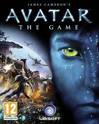
What what makes Avatar unique is its ability to appeal to a broad audience. It has a bigger meaning for the adult audience yet provides funny blue aliens and violence for the younger audience. This broad market allows for the transmedia storytelling to be successful. Avatar's film debut was huge and everyone wanted a piece of the Avatar action. Video games were made, apps developed to turn pictures into Navi's, etc.

The Planet of Pandora is nothing like Earth. Everything is large and the animals are unlike anything imaginable.

The air is toxic to humans so they had to come up with machinery and scientific advances to comfortably withstand the environment. 

Movie poster that leaves the audience guessing about what "Avatar" actually is.

Most of the characters in Avatar are computer graphics (CGs) yet have similarities to their real life bodies.

The Avatar Video Game


App sponsored by McDonalds to "Avatarize" a photo of yourself